
CASE STUDY / BRAND IDENTITY / WEBSITE DESIGN
BURRELL FARMS
& GARDENS
A Tennessee farming family with sixty years in the ground moved into hemp. They had the land and the crop. They had no mark, no colors and no typeface.
- CLIENT
- Burrell Farms & Gardens, LLC
- SECTOR
- Agriculture / Hemp
- SERVICES
- Brand Identity · Web Design · Online Store
- OBJECTIVE
- Recognition · Trust · Reach
Mason, Tennessee / Twenty-four pages covering the farm, the range and the investor side of the business
THE OPPORTUNITY
A FARM WITH NO FACE.
Burrell farms in Mason, Tennessee, and has done for decades. Hemp was the new part; the farming was not. But the business had no mark to put on anything — no colors, no type, nothing that said who it was. We started there and worked outward.
IDENTITY
A TRACTOR, A SKYLINE, A LEAF.
The mark holds the equipment that works the ground, a rising skyline and the crop itself. Two greens: a deep forest for weight, a lime for growth. It holds at the size of a browser tab and at the size of a trailer door.
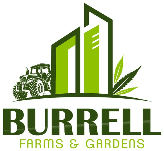
01 / PRIMARY LOCKUP — ON LIGHT
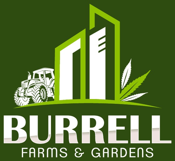
02 / REVERSED — ON FOREST
COLOR
SIX COLORS, EACH WITH ONE JOB.
The logo supplied two greens; the site needed a working palette. Forest carries the headlines and dark panels, field green the navigation and cart, ochre the main buttons and story panels. Yellow marks the rule under each heading and nothing else. Lime stays in the logo.
FOREST
#15291B
FIELD GREEN
#2B5336
OCHRE
#9B630E
HARVEST YELLOW
#EACB00
LINEN
#F4F4EE
LOGO LIME
#8EC200
TYPOGRAPHY
CONDENSED, LIKE A STENCIL ON A FEED SACK.
Oswald Bold sets every heading — narrow, heavy, agricultural without dressing up as a costume. Lato carries the body, labels and legal lines underneath it, so the whole site runs on two faces.
DISPLAY
CBD FARMING DONE RIGHT
03 / OSWALD BOLD
TEXT
Burrell Farms & Gardens seeks to establish legacies within our community through agricultural opportunities.
04 / LATO
THE SITE
THE GROUND COMES BEFORE THE PRODUCT.
The homepage opens on the field. The photograph runs full width under a forest wash, with the headline, a gold rule and one ochre button on top, so a visitor meets the ground before the product.
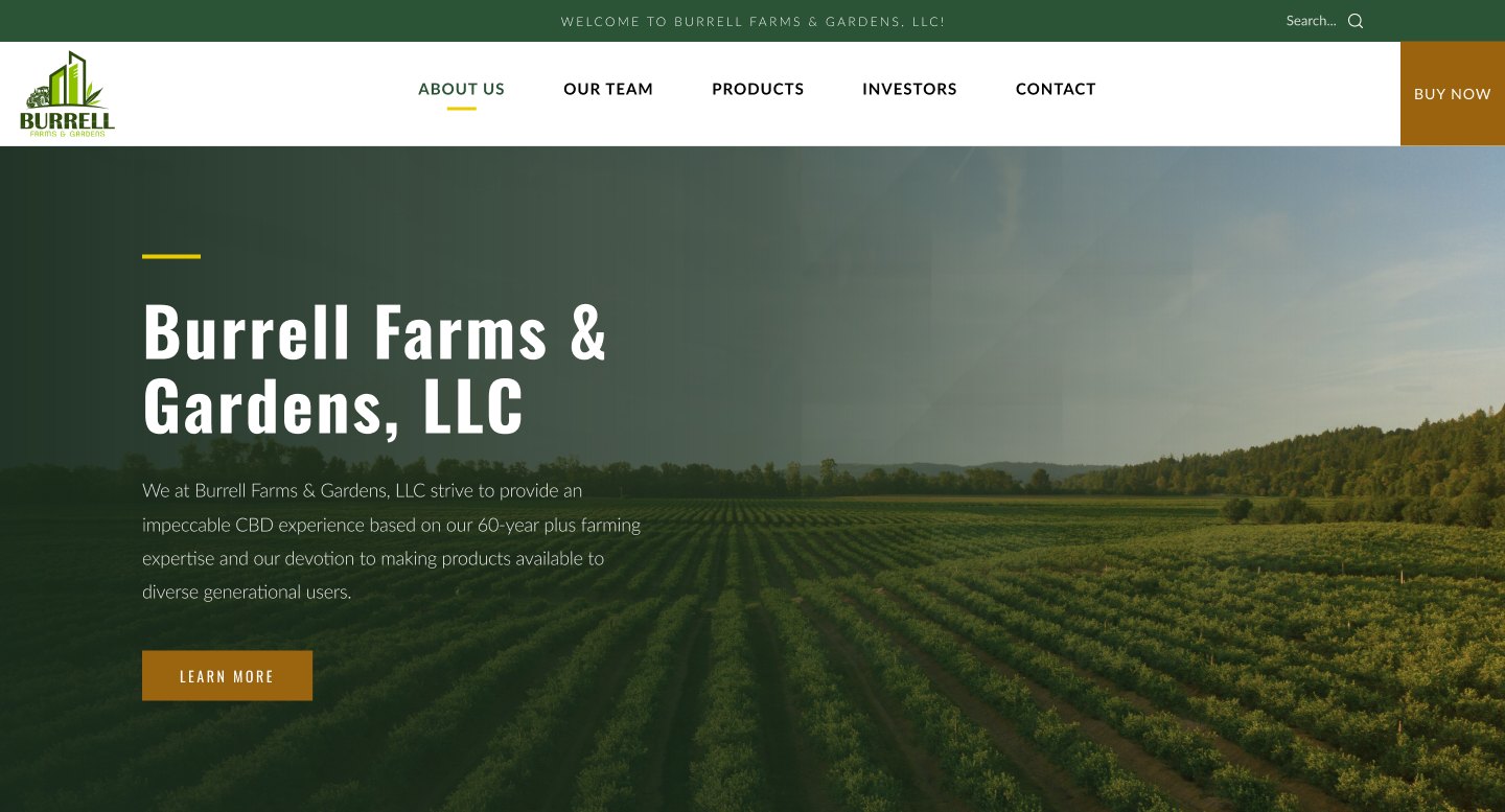
05 / HOMEPAGE — DESKTOP
OUR STORY
SIXTY YEARS, STATED PLAINLY.
The about page has one job: establish that these people have farmed for a long time. The patriarch has over six decades in and a Certified Farmer designation from the Tennessee Department of Agriculture. The page says so and then stops.
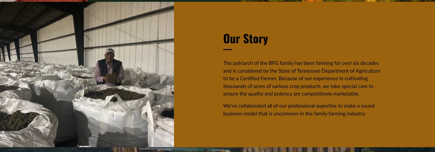
06 / OUR STORY — DESKTOP
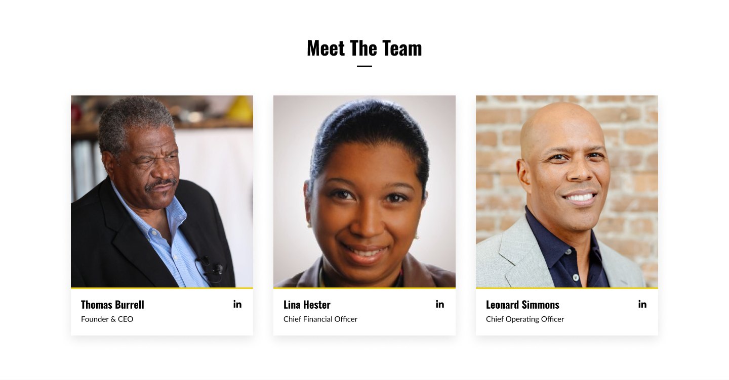
07 / MEET THE TEAM
PRODUCTS
THREE CATEGORIES, ONE SHELF.
Oils, gummies and flower each take a panel of their own, built on one structure, so the range holds together instead of looking like three separate experiments. The shop and the product pages carry the same system through to the cart.
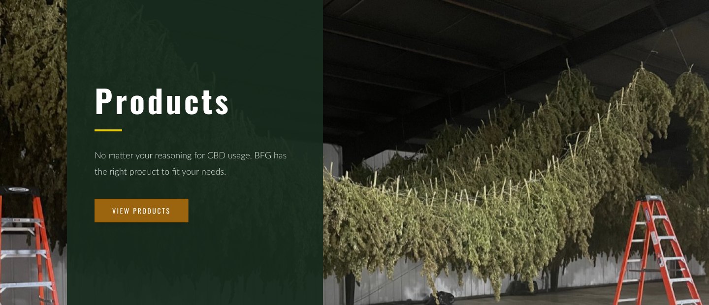
08 / PRODUCTS — DESKTOP
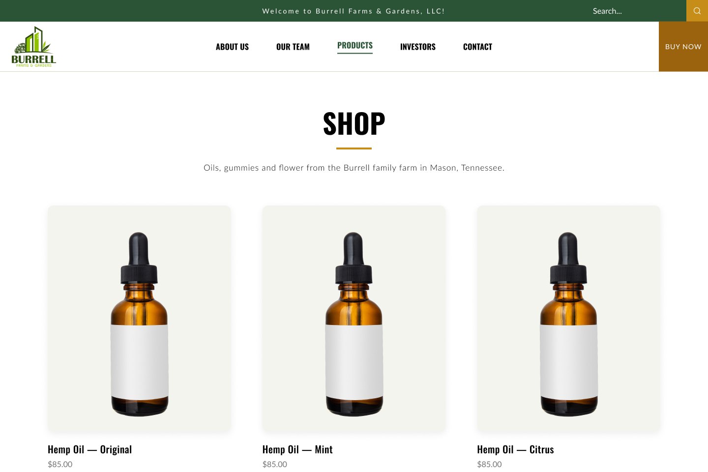
09 / SHOP
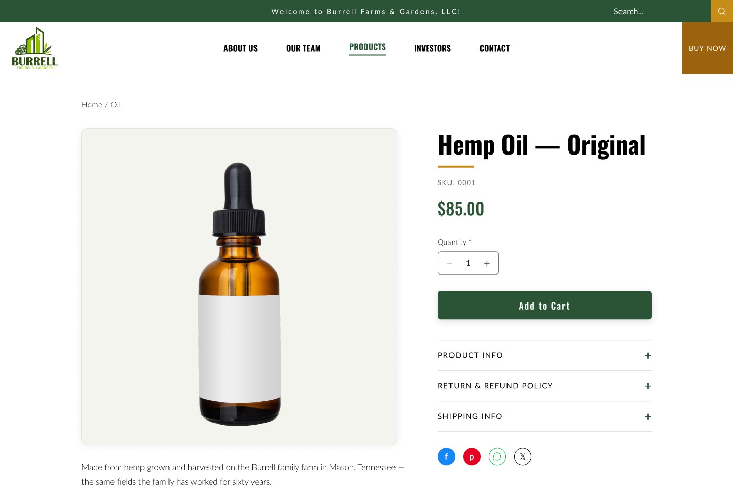
10 / PRODUCT PAGE
INVESTORS
A SECOND AUDIENCE ON THE SAME SITE.
Burrell needed to talk to investors as well as customers. Instead of a second site, the investor track lives inside the first: its own section, its own contact route, the same identity throughout.
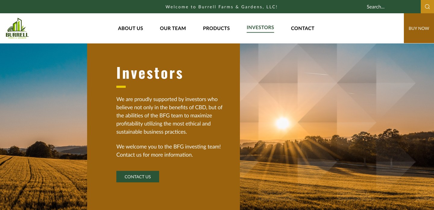
11 / INVESTORS — DESKTOP
RESPONSIVE
BUILT FOR A PHONE IN A FIELD.
The mobile layout is its own composition, not a squeezed desktop. Navigation collapses to one control, panels run full width, and the photography keeps its crop.
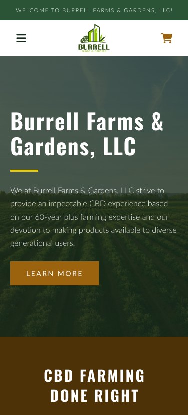
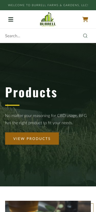
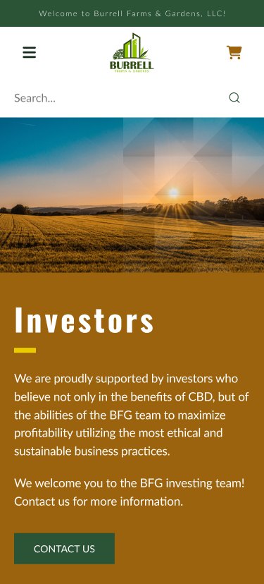
12 / HOME, PRODUCTS AND INVESTORS AT 390
WHAT WAS DELIVERED
A FARM THAT LOOKS LIKE A BUSINESS.
Burrell went from no visual identity to a mark, a palette and a type system, and a site that carries all three from the homepage through the shop, product pages and checkout, on a desktop and on a phone.
- 24
- PAGES REDESIGNED
- 6
- COLORS IN THE PALETTE
- 2
- TYPEFACES
- 2
- BREAKPOINTS DRAWN
SCOPE, NOT OUTCOMES
24, 6, 2 and 2 describe what was designed. They are not measured changes in traffic, orders or inquiries.
NEXT PROJECT
Partners in Majority Law Firms