
01
GLASS WITH A REASON
Frosted glass only appears where there’s sky or a photo behind it to blur. On a flat background, surfaces stay solid.

CASE STUDY / BRAND IDENTITY / WEBSITE / MOBILE APP
A travel company we designed and built from the logo up. One booking website, one native-feeling app, and a single trip that holds your flights, your stay and the places worth finding once you land.
Wordmark, color and type. A booking website that scrolls you down through the clouds into five cities. A four-tab app for planning the trip from your phone.
THE OPPORTUNITY
Wander had to feel like a travel company that had been around for years and had opinions. Calm and photographic, closer to a window seat than a booking engine. It also had to tell the truth. In early access a booking is a request, so nothing on the site or in the app claims a seat is confirmed when it isn’t.
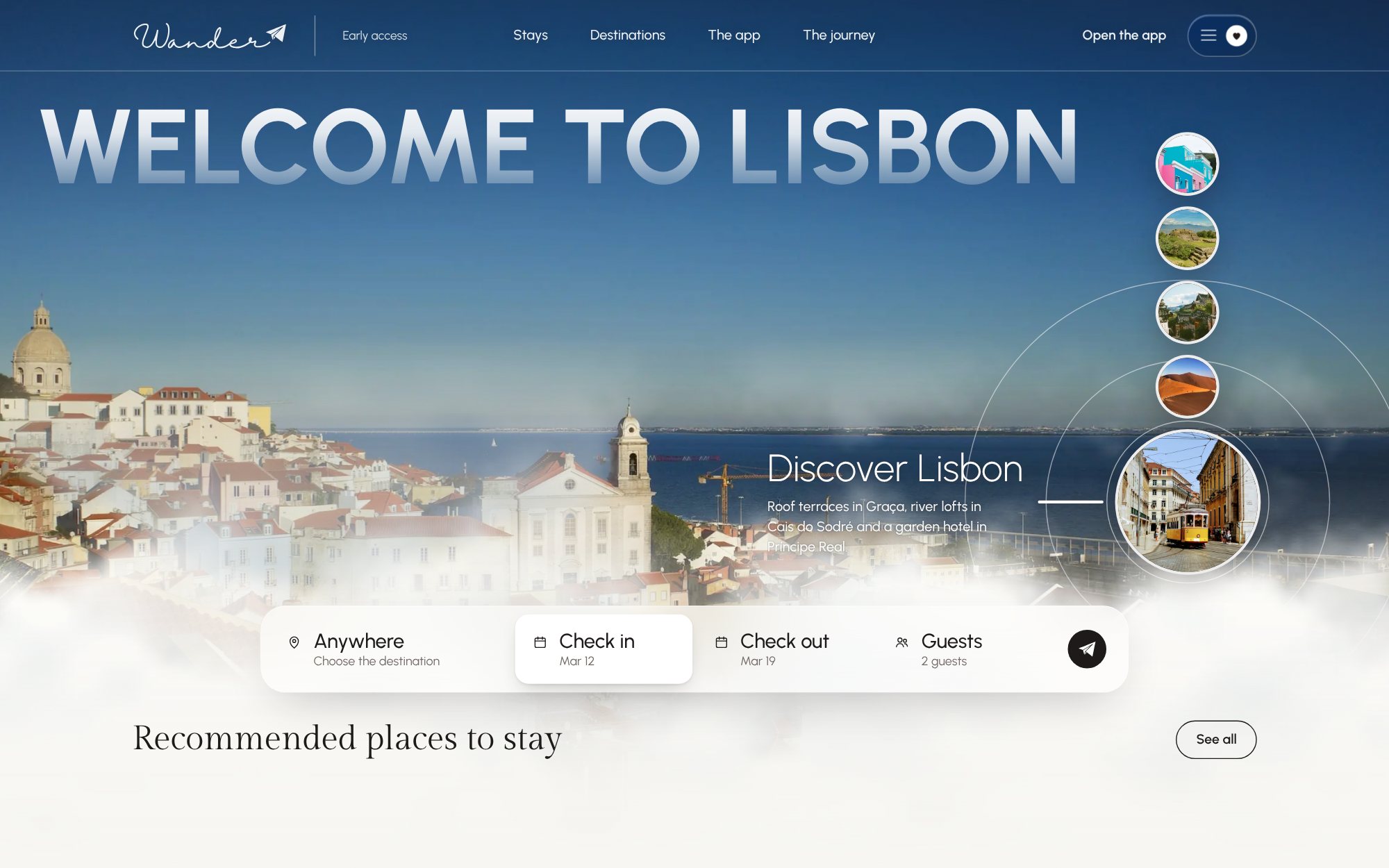
01 / HOMEPAGE — WELCOME TO LISBON, WITH SEARCH
THE APPROACH
We built Wander three times before choosing. Each version solved a different part of the brief, and each one is in the final product somewhere.
A
CINEMATIC
You scroll from a window seat down through the clouds and land in each city.
B
STRUCTURED
Booking first. A website and an app that borrow what the best rental apps get right about cards and navigation.
C
EDITORIAL
Built like a magazine, with a stay page that gives every place room.
The final product takes A’s scroll, B’s website and Discover screen, and C’s stay page. One neutral palette ties them together, borrowed from private aviation rather than from other travel apps.
IDENTITY
The wordmark is a single cursive line ending in a paper plane, the only aircraft the brand allows itself. We thickened the lettering by 15% so it survives at app-icon size. Then the paper plane replaced every airplane icon on the site and in the app.
02 / WORDMARK — WRITES ITSELF IN



03 / REVERSED ON ESPRESSO · ON MIST · THE PAPER PLANE ON ITS OWN
FIRST SCREEN
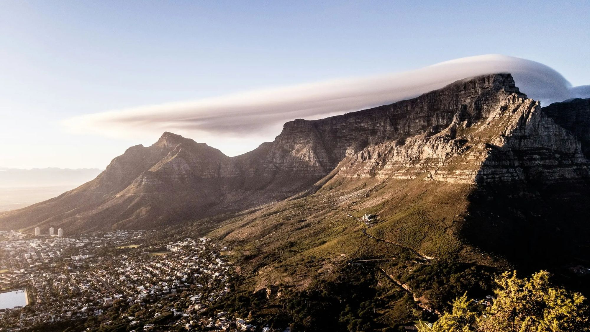
The app opens on Table Mountain with one line and one button. Tap it and you’re in.
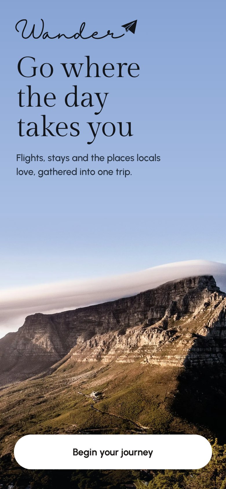
04 / APP LANDING — TABLE MOUNTAIN, CAPE TOWN
COLOR
The photographs bring the color. The interface stays quiet so a street in Oaxaca or a dune in the Namib can do the talking.
OFF-WHITE
#F7F6F2
ESPRESSO
#181414
SKY
#A8CCD8
MIST
#D8E4E4
TYPOGRAPHY
Gilda Display sets every place name, from the small labels on destination cards to the city titles that fill the screen as you scroll. Urbanist covers everything else in one variable family. Bold capitals for the hero, a light weight for big lead lines, regular to semibold for the interface, and extra bold for the tiny labels. The wordmark isn’t a typeface at all. It’s custom lettering.
Lisbon
Aa Bb Cc Dd Ee Ff Gg 0123456789
05 / GILDA DISPLAY — PLACE NAMES AND CITY TITLES
Where to?
Anywhere · Mar 12 – 19 · 2 guests
Begin your journey06 / URBANIST REGULAR TO SEMIBOLD — THE INTERFACE
Welcome
to Lisbon
07 / URBANIST BOLD, ALL CAPS — THE HERO
08 / ONE VARIABLE FAMILY — URBANIST 300 TO 800
THE WEBSITE
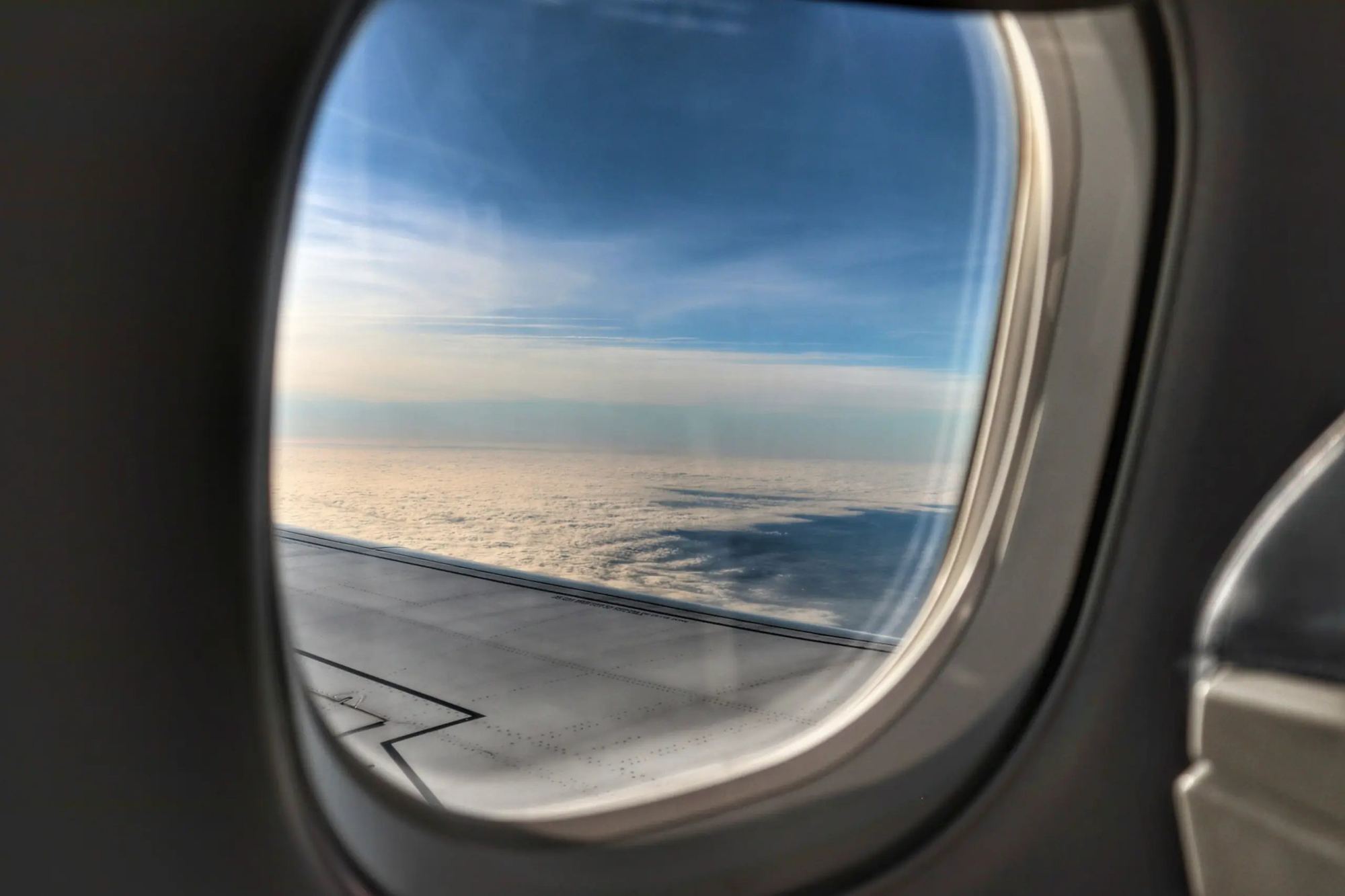
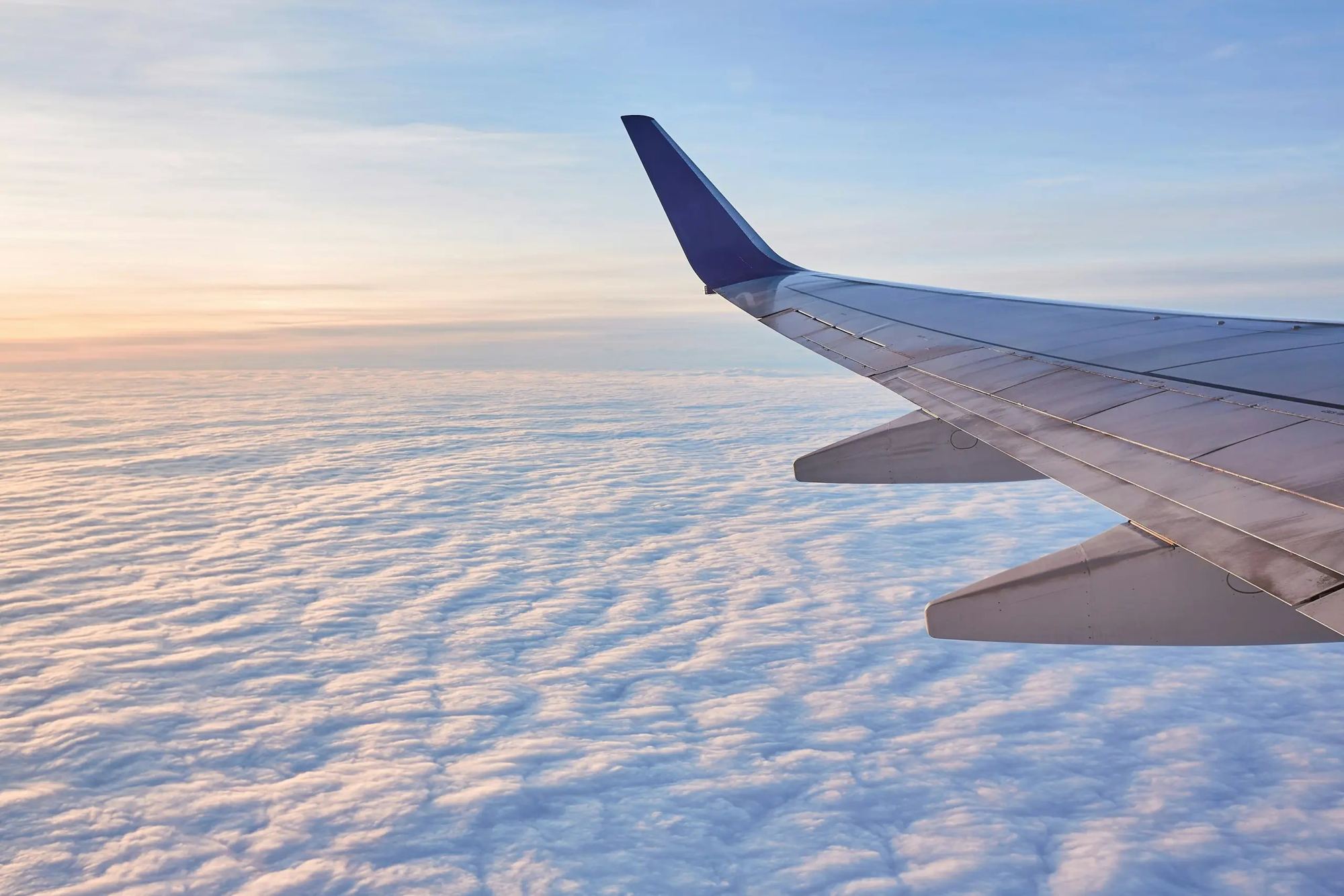
The homepage opens on a full-bleed carousel of destinations, then drops into cloud. Keep scrolling and you pass the wing, then the aircraft, and come down over Lisbon. Seoul comes next, then Oaxaca. Then the dunes of Sossusvlei and Cape Town. The last stop is a dinner table, because the people you meet are part of the trip too.
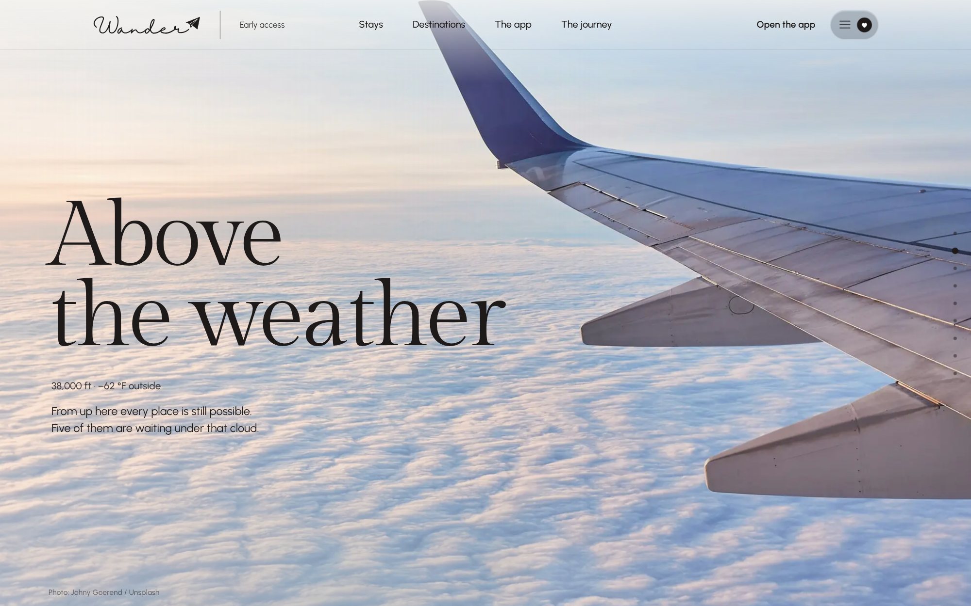
09 / JOURNEY — ABOVE THE WEATHER
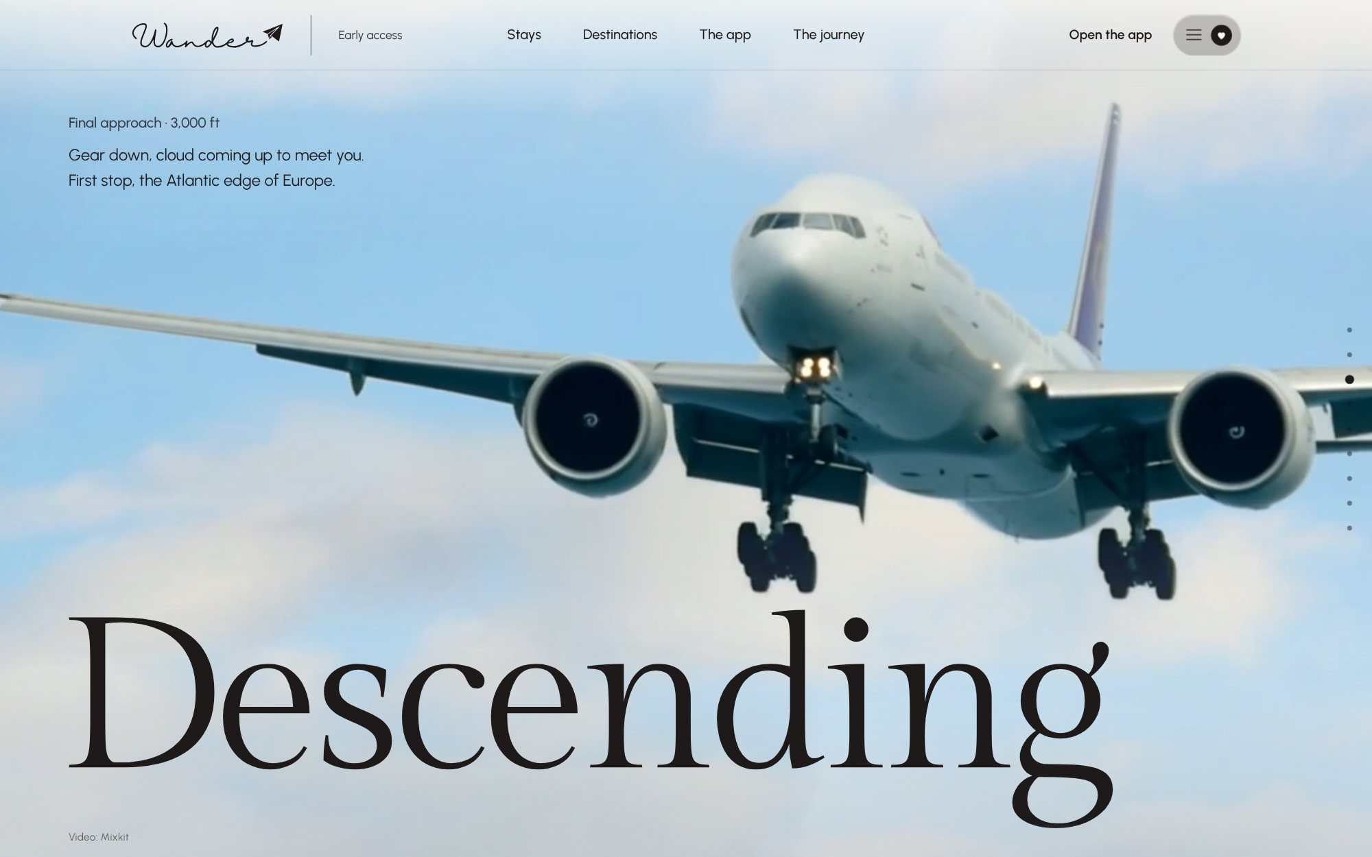
10 / JOURNEY — DESCENDING
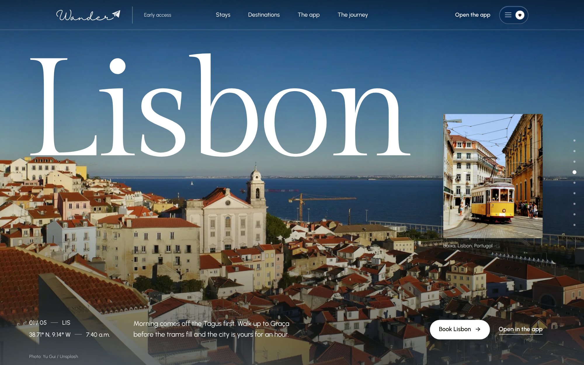
11 / CHAPTER — LISBON
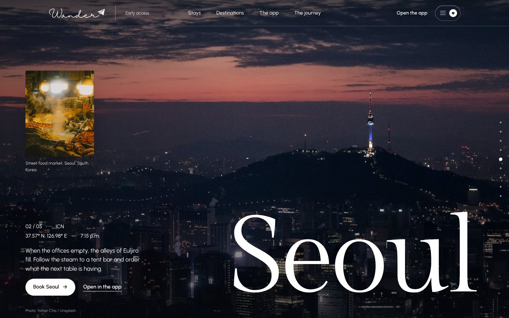
12 / CHAPTER — SEOUL
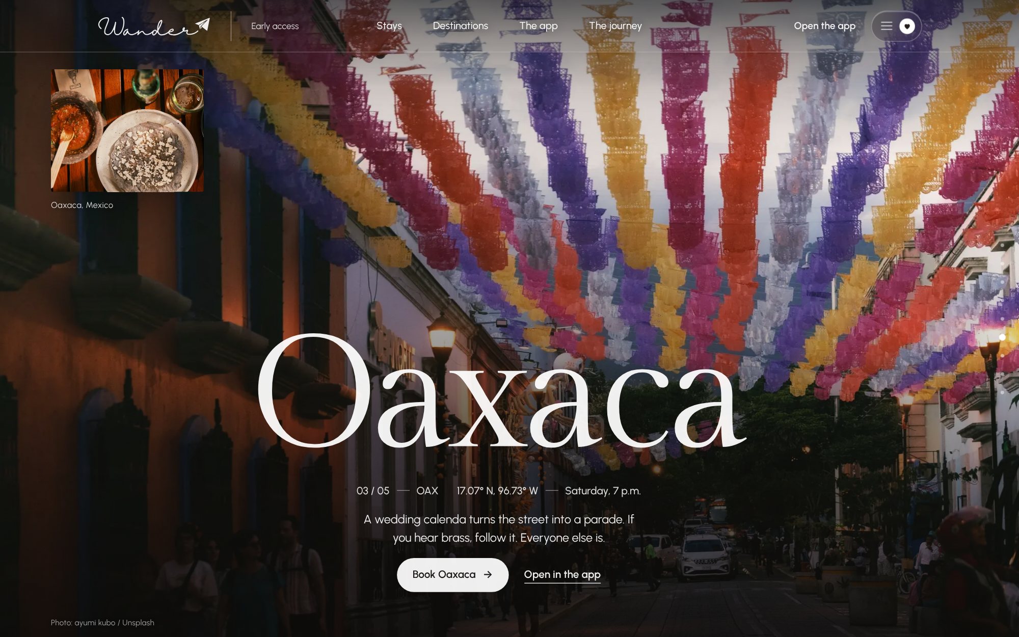
13 / CHAPTER — OAXACA
BOOKING PLATFORM
Pick a destination, dates and guests, or drag the world map until something looks good. Every destination has its own tabs for stays, flights, things to do and events. The stay page has the gallery, the full price breakdown and a request to book. Checkout takes three steps.
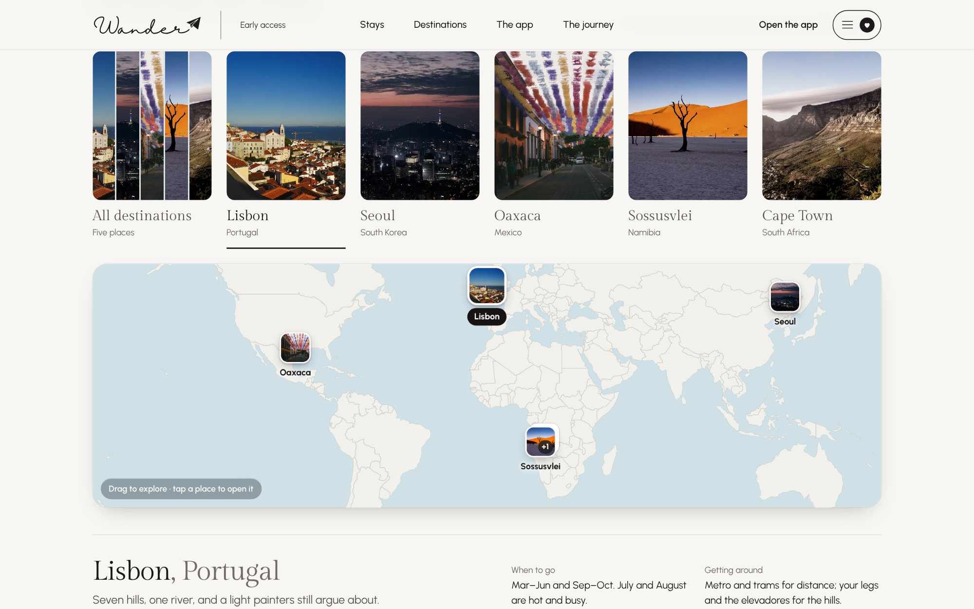
14 / BOOKING — EXPLORABLE WORLD MAP AND DESTINATION TABS
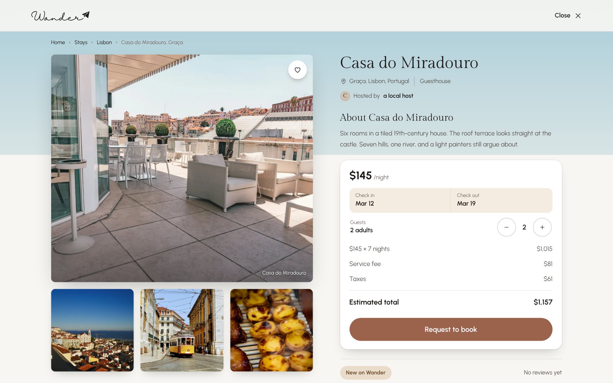
15 / STAY — CASA DO MIRADOURO, WITH THE BOOKING CARD
THE APP
Four tabs live in a floating pill at the bottom of the screen. Discover opens with search and a grid of destination photos. Plan puts flights and stays for each city side by side. People is opt-in, for meeting travelers who’ll be there the same week. Trip keeps everything you’ve saved, with a running estimate.
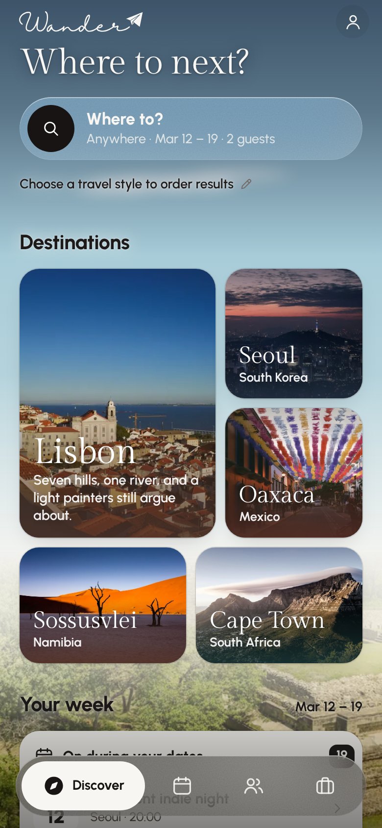
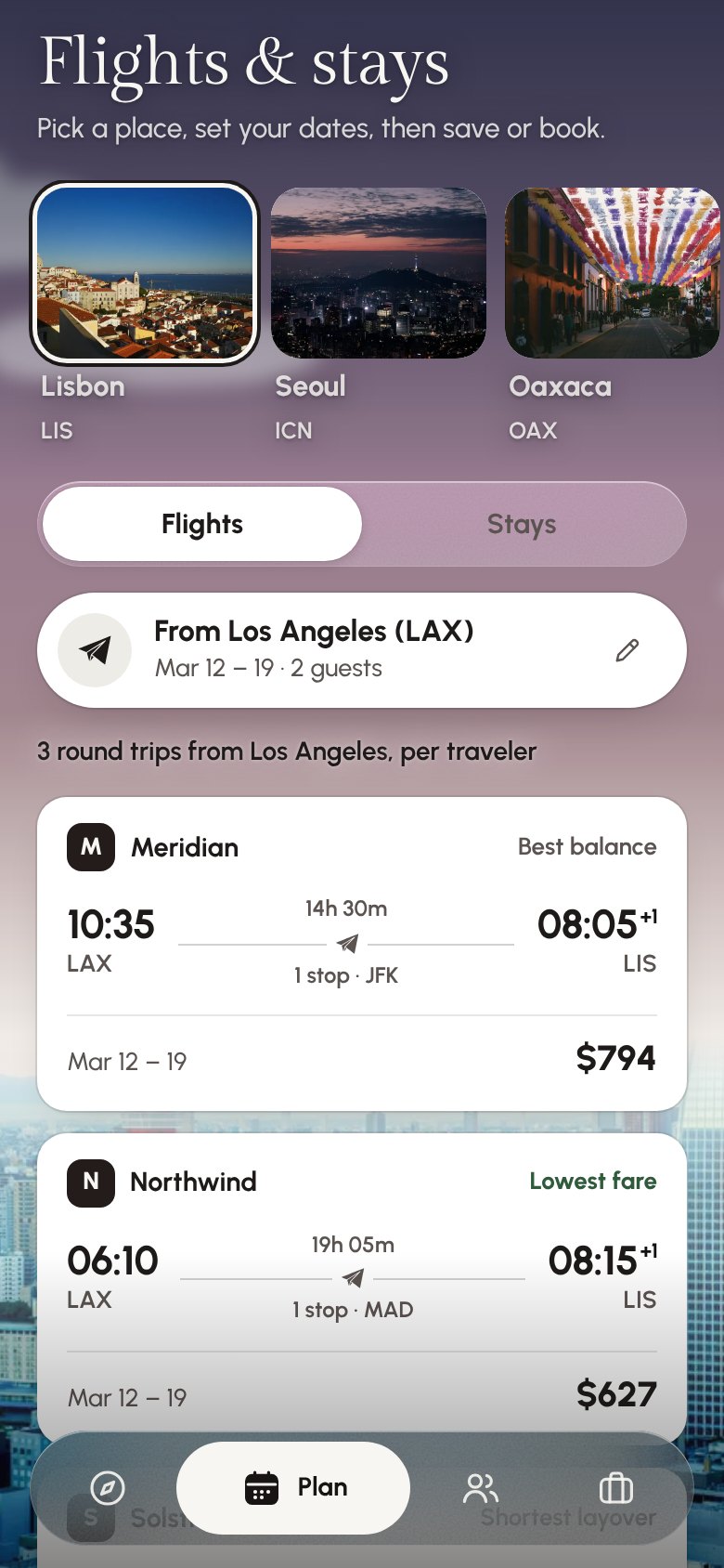
16 / APP — LANDING, DISCOVER AND PLAN
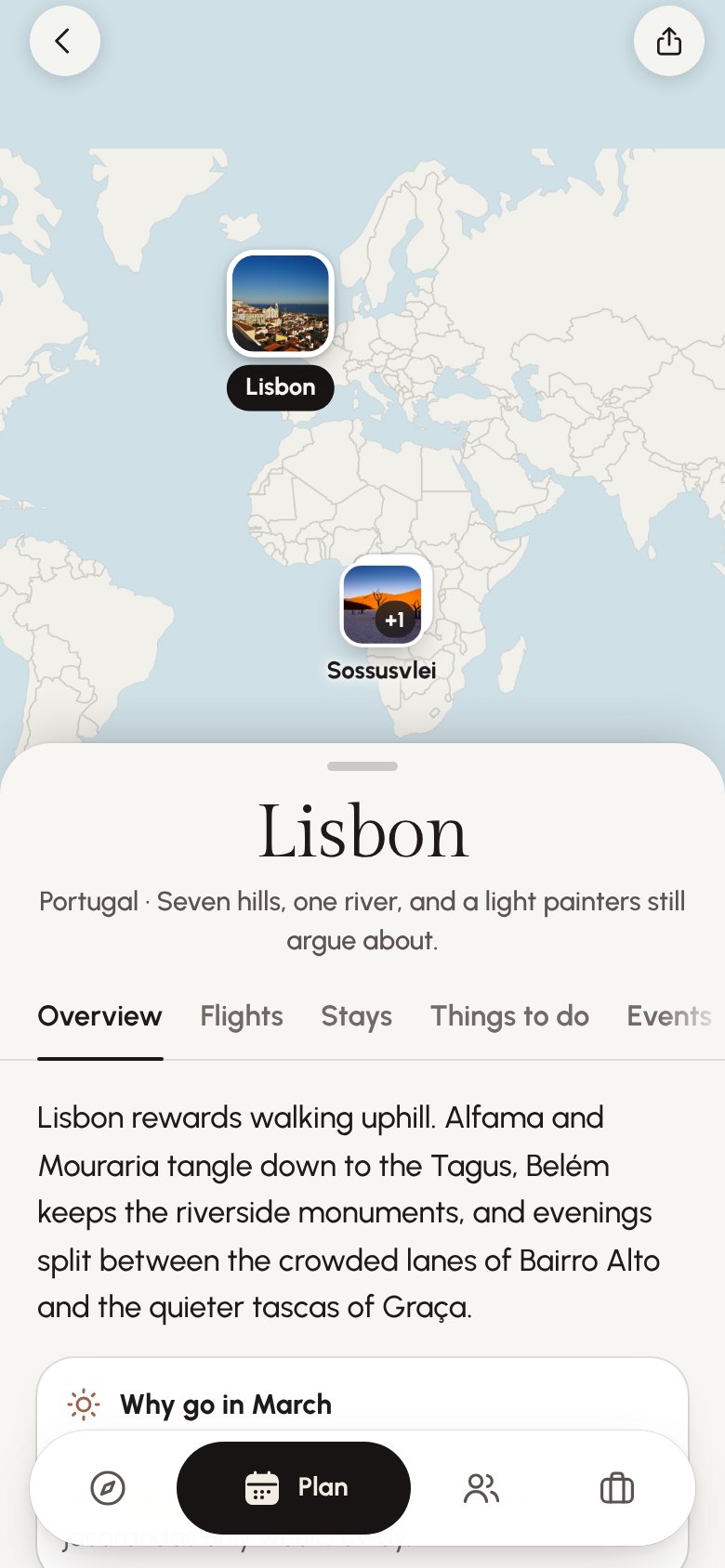
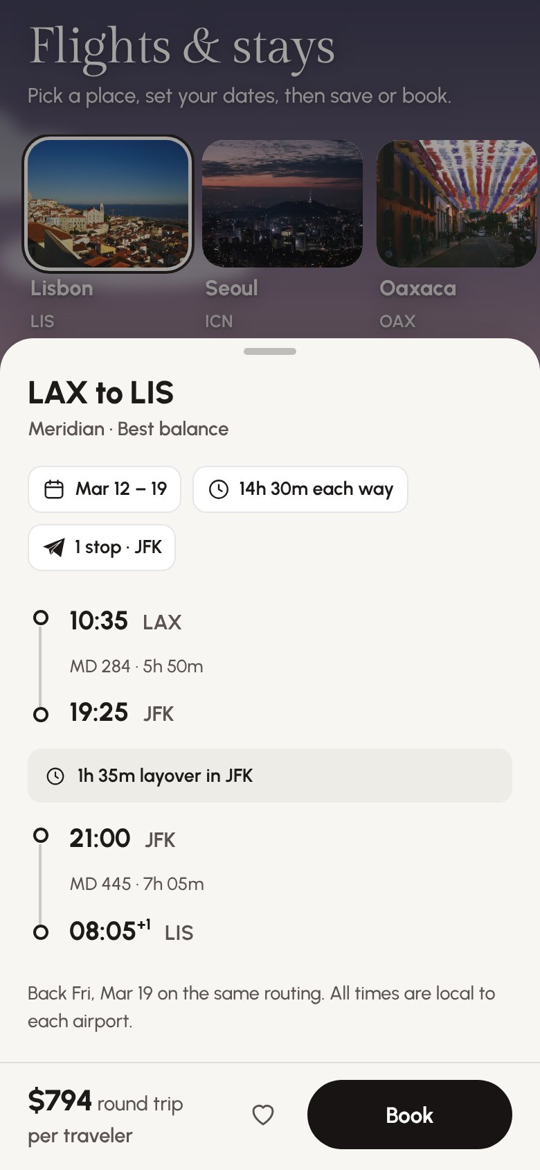
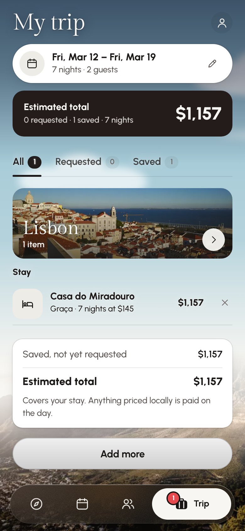
17 / APP — DESTINATION MAP, FLIGHT DETAIL AND MY TRIP
A SKY THAT KEEPS TIME
The clouds drift. Over the day the light turns to dusk, then night, and the stars come out. Text checks what’s behind it and flips between light and dark so it’s always readable. Glass only shows up where there’s sky or a photo underneath.
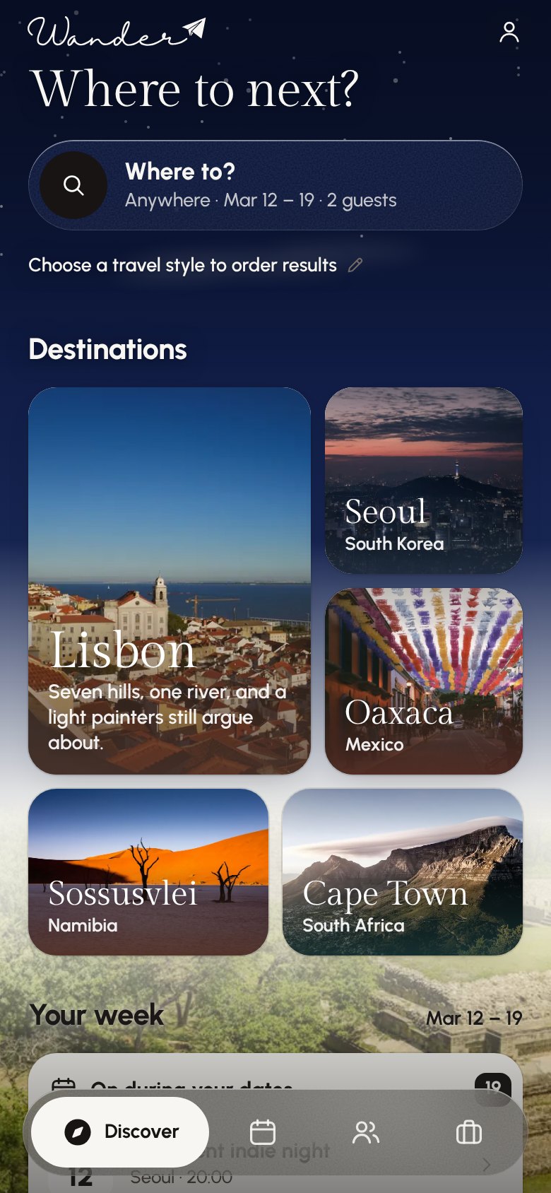
18 / DISCOVER — DAY AND NIGHT
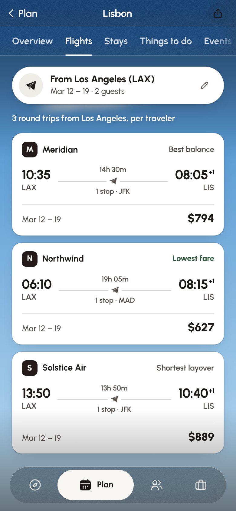
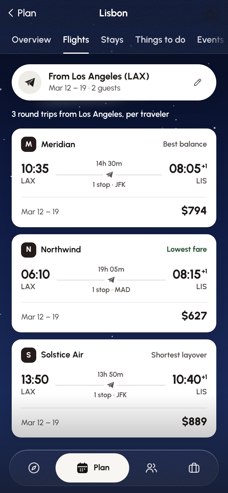
19 / LISBON FLIGHTS — DAY AND NIGHT
DETAILS
01
Frosted glass only appears where there’s sky or a photo behind it to blur. On a flat background, surfaces stay solid.
02
When map pins overlap they merge into one pin with a count, and split apart as you zoom in.
03
A booking stays a request until it’s confirmed. A new stay says “No reviews yet” rather than borrowing a rating.
04
39 licensed photographs, every one taken in the place it shows. No stock stand-ins.
05
Pill buttons sized for a thumb. Every sheet closes with a swipe down.
06
Scenes stop rendering once they scroll off screen, and the app respects the phone’s reduced-motion setting.
UNDER THE HOOD
Wander runs on React and TypeScript and was designed for the phone before the desktop. The world map ships as vector data inside the app, so there’s no map service to pay for or wait on. The day-to-night sky is CSS, which means the graphics chip does the work and the battery doesn’t.
WHAT WAS DELIVERED
Live in early access. Still in active development as a Tribe UNLTD venture.
NEXT PROJECT
Inglewood Open Studios