
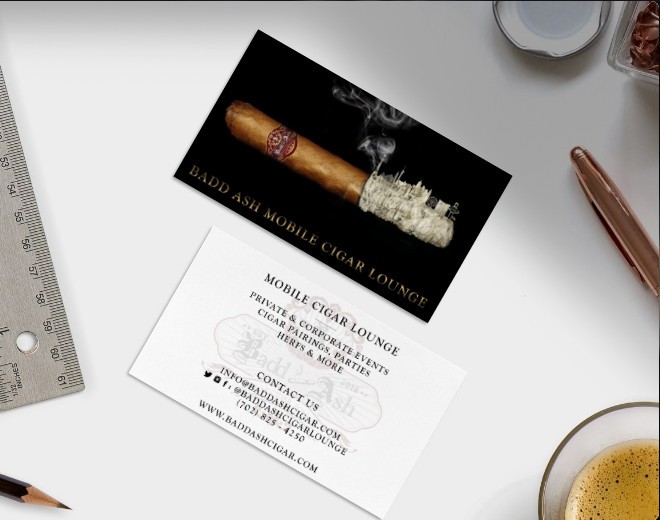
19 / BUSINESS CARDS
Front and back.
The wordmark runs along the long edge of the front. The back holds the watermark and the details — the only time the mark gives way to the information.
CASE STUDY / BRAND IDENTITY / WEB DESIGN
A lounge that arrives on a trailer. The brand had to work at the scale of a label and at the scale of the vehicle it pulls up in.
Crest identity, website, apparel, cigar wraps, printed goods, a full vehicle wrap and a brand film
FILM
The build closed with a short brand film for the top of the site. It is less a product shot than a sense of the room the trailer becomes once it is open.
02 / BRAND FILM
IDENTITY
Cigar culture reads in bands, seals and engraving, so the mark is a crest: a blackletter monogram, a banner, a founding date and a frame fine enough to survive being printed small. It is drawn in three colorways because it has to sit on a label, a shirt, a screen and a trailer.
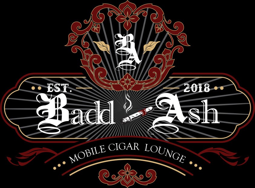
03 / PRIMARY CREST
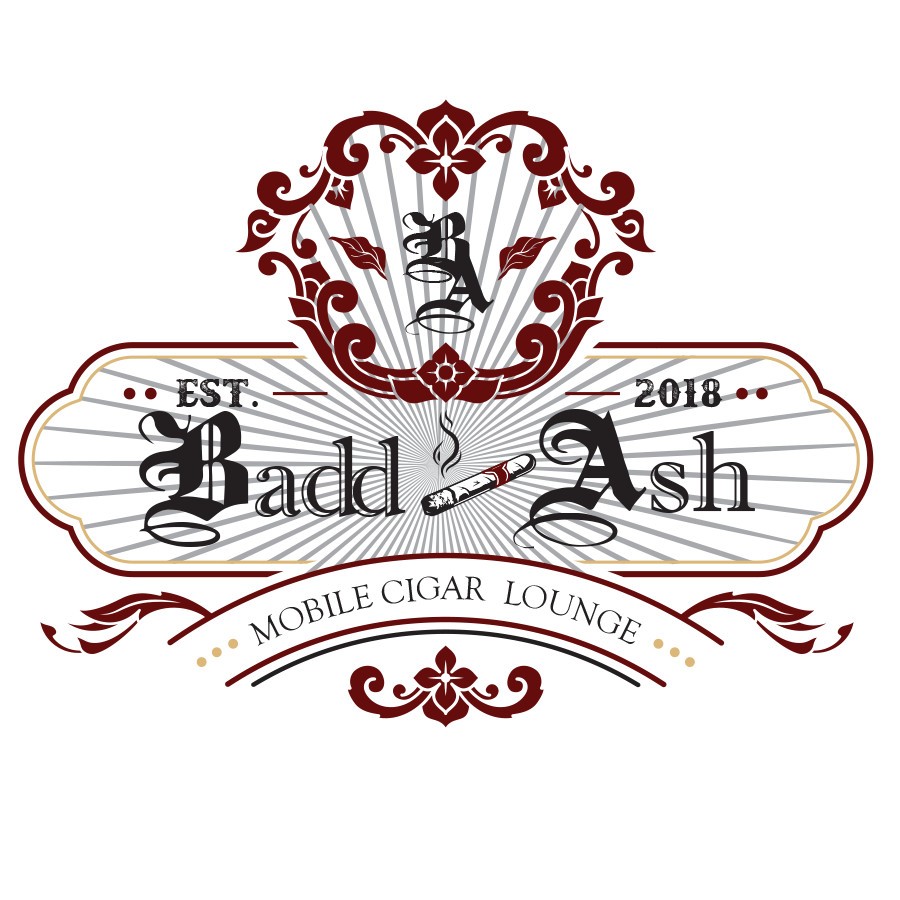
04 / CREST — ON LIGHT
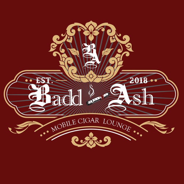
05 / CREST — ON CRIMSON
06 / MONOGRAM — CRIMSON
07 / MONOGRAM — GOLD
08 / MONOGRAM — WHITE
CUSTOM LETTERFORM
The BA monogram is a custom letterform. It was created as a shape so the blackletter weight, the overlap and the tail of the A could be tuned to hold together at label size — no font file reproduces it, and none should be substituted for it. The lettering inside the crest is drawn to match. Everything else on the site and in print is set in the two faces below.
COLOR
A deep crimson carries the crest, a near-black gives it a ground, and a leaf gold handles the engraving so the fine detail survives at label size. Two grays sit underneath for rules and panels.
EMBER CRIMSON / CREST: #600C0C
ASH BLACK / GROUND: #181818
LEAF GOLD / FOIL: #D8B478
SMOKE / RULES: #909090
PALE SMOKE / PANELS: #D8D8D8
PAPER WHITE / REVERSE: #FCFCFC
DISPLAY
BADD ASH
MOBILE CIGAR LOUNGE
10 / DISPLAY — TYPEFACE TO CONFIRM
TEXT
Book the trailer for an evening and the lounge arrives built: seating, humidor, service.
11 / TEXT — TYPEFACE TO CONFIRM
THE SITE
The whole business is a booking, so the site is built around one: packages laid out side by side with what each includes, and a shop carrying the apparel. The identity stays dark throughout, which is what the room actually looks like.
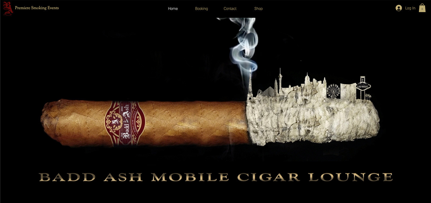
12 / HOMEPAGE
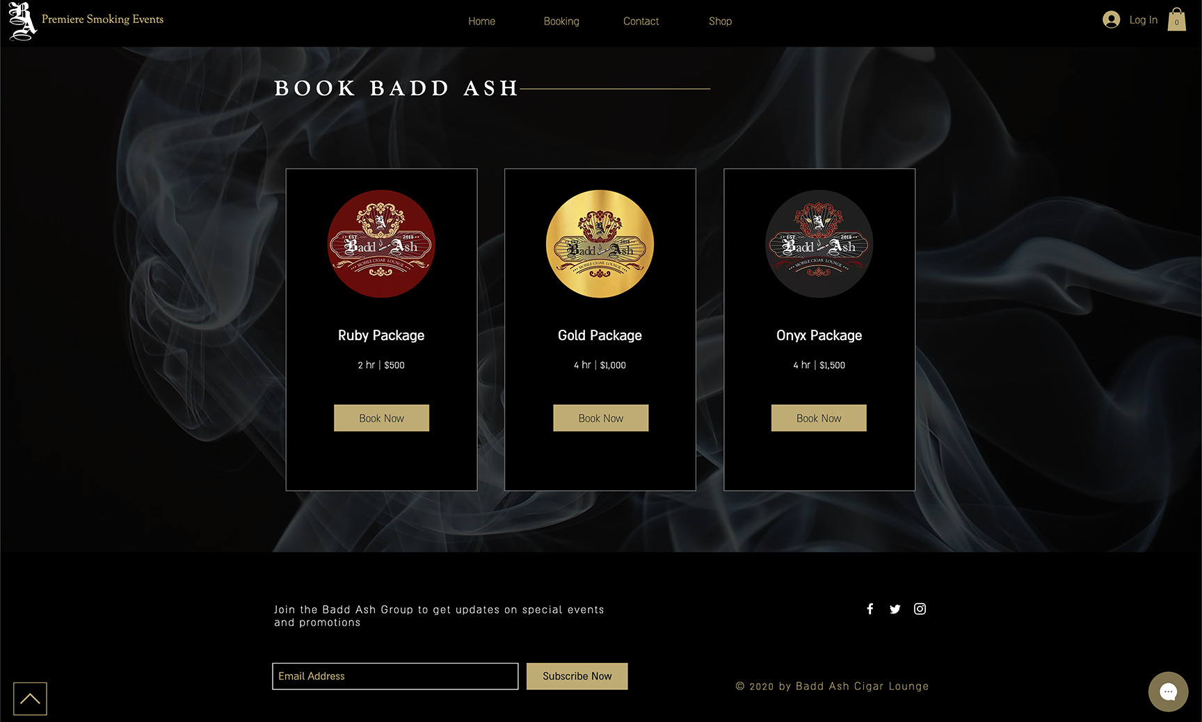
13 / BOOK BADD ASH
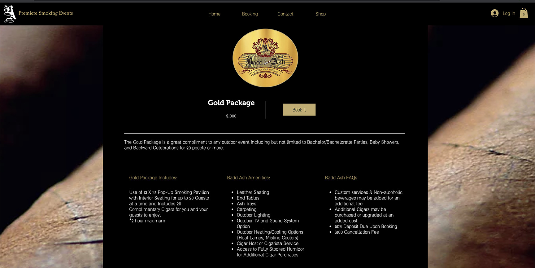
14 / PACKAGE DETAIL
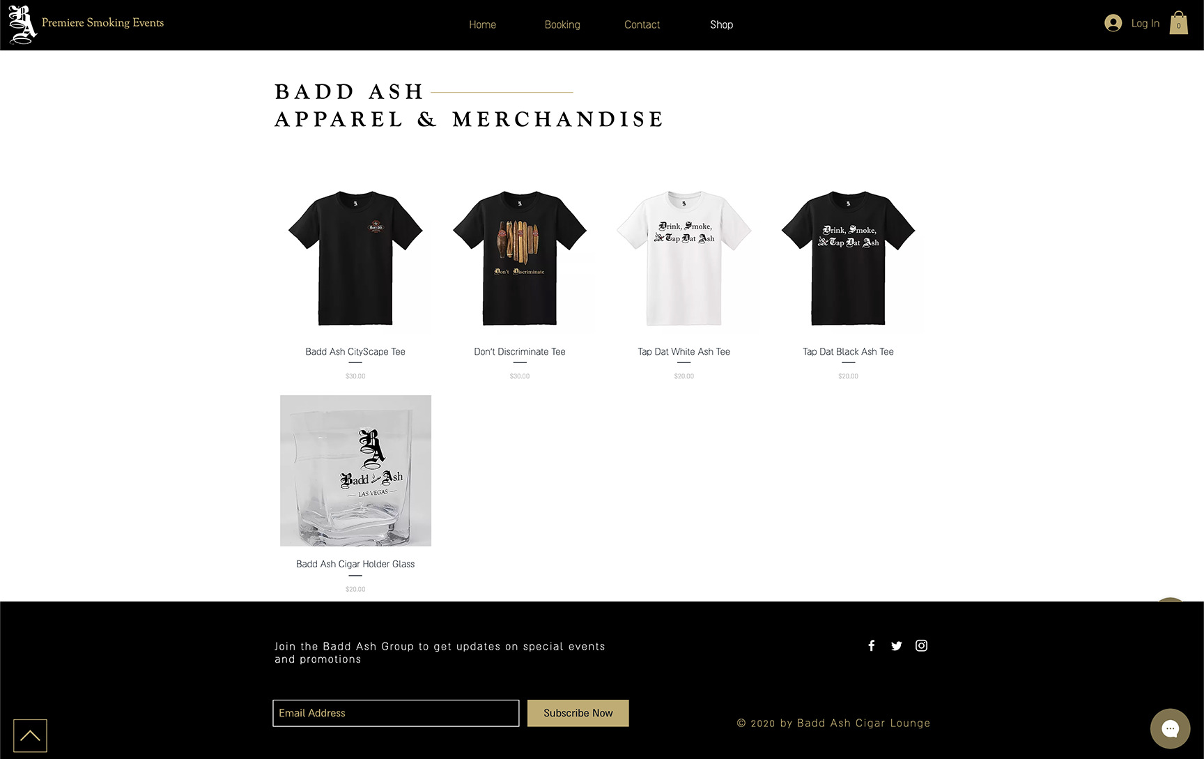
15 / APPAREL & MERCHANDISE
WRAP
There is no storefront to put a mark on, so the vehicle carries the whole identity. At this size the engraving thins out and the silhouette and the banner do the reading — from a car park, at speed, in the dark.
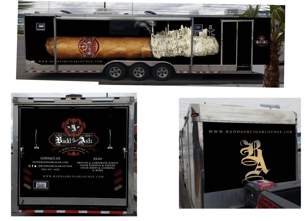
17 / FULL VEHICLE WRAP
MERCH
Apparel is the part of the brand that leaves with people. The monogram takes over wherever the full crest would close up — a chest hit, a sleeve, the front of a cap.
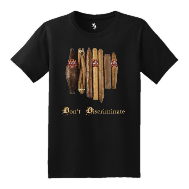
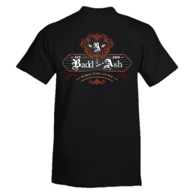
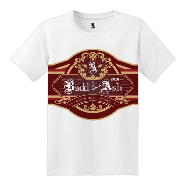
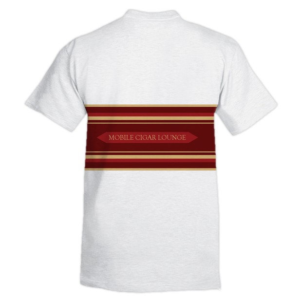
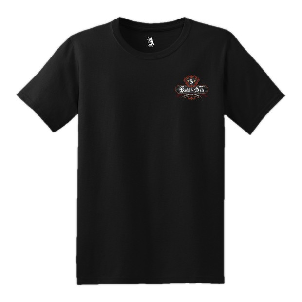
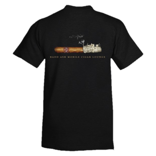
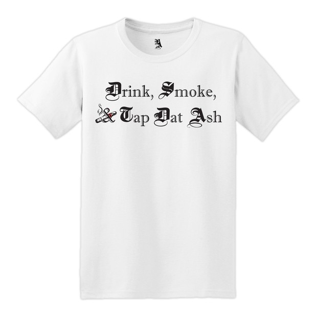
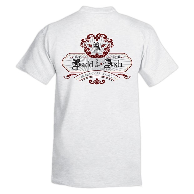
18 / APPAREL RUN
STATIONERY
The one place in the system where the crest steps back. The front gives the whole card to the key art; the back drops the mark to a watermark and sets the contact details on top of it.
19 / BUSINESS CARDS
The wordmark runs along the long edge of the front. The back holds the watermark and the details — the only time the mark gives way to the information.
WHAT WAS DELIVERED
Badd Ash went from a name to a crest system, a palette, a booking site, an apparel run, cigar wraps, printed goods, a wrapped vehicle and a brand film — one identity from the card in your hand to the trailer in the drive.
SCOPE, NOT OUTCOMES
These are counts of what was designed and built, not measured changes in bookings, attendance or revenue.
NEXT PROJECT
Burrell Farms & Gardens